top of page

Decoding Globitel’s Brand
Globitel is all about keeping people connected. As a leading provider of telecom and customer experience solutions, the brand focuses on innovation, reliability, and making communication seamless across industries like telecom, finance, government, and more.

The Visual Story
The visual identity reflects a forward-thinking, tech-savvy brand that’s all about trust and efficiency. Every element logo, colors, and typography works together to create a clean and modern look that speaks to Globitel’s expertise in telecom solutions.


Logo & Emblem
The emblem in the Globitel logo serves as a visual representation of the company's mission and expertise. It is designed to symbolize seamless communication, digital transformation, and a commitment to excellence in the telecom industry. The emblem complements the wordmark, maintaining balance and versatility across different branding applications.


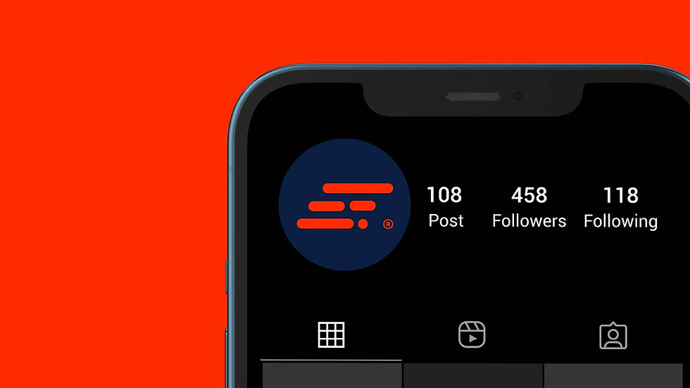

Application & Usage
Globitel’s branding is built for versatility, seamlessly fitting digital platforms, marketing materials, product interfaces, and corporate visuals. It ensures a strong, cohesive presence across all touchpoints.


Visual Gallery
A custom visual library was created to align with the branding and support Globitel’s brand strategy. The images were generated using various AI tools, ensuring consistency, innovation, and a modern aesthetic across all brand materials.


Similar Projects
bottom of page